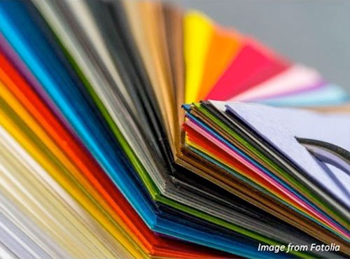
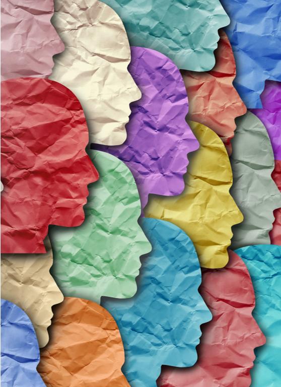
Do you understand the role of colour in business communication?
Much of what has been written about the role of colour in business, especially the marketing end of it, is nonsense.
Design experts have been trying for decades to link colours to emotions but, as is so often the case where personal preference and life experience plays a major role, their efforts have largely been discredited.
Research has proven again and again that, while certain broad conclusions can be drawn such as the different colour preferences of men and women, cultural influences play a major part in those choices too. So universal truths are hard to pin down.
Broadly, here’s what we know based on various respected research studies analysed and published by Joe Hallock (www.joehallock.com.edu).
Blue is everyone’s favourite
Given the choice between eight colours, most people, regardless of age or sex, choose blue. Which disproves the often-quoted belief that blue somehow represents cold and fear. Actually, people like blue and similar colours in that range because they find them calming and relaxing.
Blue’s association with cold may have a lot to do with the way water taps are marked and seawater and swimming pools are observed.
Yellow, despite claims that it is psychologically the happiest colour in the spectrum, is liked by only three percent. However, as the research group comprised people who have grown up in Western societies, we can’t assume this applies to equally to all cultures.
In certain African countries, for example, women in particular are discouraged to wear anything red.
Preferences depend on who we are
When the results for the sexes are split from the overall findings, once again blue emerges as the favourite. For women, the second favourite choice is purple, a colour with a similar wavelength.
The men voted for green and black as their second and third colours. It’s important to note that these choices are made without reference to any application such as favourite car or clothing.
When we’re young we like yellow, green and purple, but as we grow older, blue once again dominates. These changes are probably the result of cultural awareness. For example, black and purple in Western culture have close links to death and mourning.
Colours nobody likes
Orange, brown and yellow are the least attractive overall, despite orange being described as bright, warm, energetic and jovial.
Colours with the lowest appeal to women are orange, brown, grey and yellow. Men dislike brown, orange, purple and yellow.
How do we apply colour to business communication?
As we’ve said, personal preferences, age, upbringing and culture have a major impact on the way we feel about various colours. The idea, for example, that using a particular colour in your logo or on your packaging triggers some kind of deep emotional response is not supported by scientific analysis.
What we do know is that certain colours just seem to fit certain brands and product types more easily than others, although the personality you wish to project for your brand is more important.
Outdoor products are usually associated with green, brown and yellow because designers believe these are strong, rugged, tones that represent soil, forests, beaches and sunshine. So purple hiking boots are unlikely to be an overnight success.
Green, often described as a calm, peaceful colour becomes something quite different when associated with mint flavoured chewing gum or Land Rover SUVs crashing along the African savannah.
When to be different
Because consumers prefer recognizable brands, colours play a major role in brand identity.
Everyone knows the colour of McDonald’s arches, the Harley Davidson badge and the Shell logo, and imitators of famous brands often choose similar colours and design cues.
So if you’re entering a market where consumer preferences are well established, you should seriously consider breaking away from the usual palette and look for new combinations of colours and graphics
If in doubt, ask the customer
There are certain colours your common sense tells you to avoid and this is especially true in the food industry.
Because black and green mould grow on stale bread, you’re unlikely to have much success if you proudly display your fresh loaves in a clear wrapping with green or black graphics.
Brown, dark red and purple are dense, warm colours, not recommended for bottled water, diet crackers or butter. These examples are obvious but not all product categories are quite so easy.
If you’re unsure, create mock ups of your pack designs, web pages or logo options and arrange for a research company to test various alternatives among representatives of your target market.
The results should give you confidence that your product will stand out in a way that will gain consumer acceptance.
If you liked, then please subscribe to our YouTube Channel for video content. You can also find us on Twitter, Facebook, Instagram and Linkedin.